Data Engineering · 2026
Economic Indicators Dashboard
A fully automated ETL pipeline tracking 13 macroeconomic and financial indicators from FRED and Alpha Vantage into PostgreSQL, refreshed nightly and explorable through a Streamlit dashboard.
- Python
- PostgreSQL
- Docker
- ETL
- Streamlit
- Role
- Design · Build
- Timeline
- 2026 · Apr-Jun
Why I built it
I had been taking data engineering courses and wanted to put the whole thing into practice in one place instead of as isolated exercises: consuming public APIs that agree on nothing, transforming their payloads into a common shape, loading them into PostgreSQL, and wiring the ETL concepts together into something that actually runs on a schedule. Macroeconomic indicators were a good excuse: they are free, genuinely messy, and spread across two APIs with different formats, frequencies and rate limits.
The approach
I wanted to build the whole shape of a data pipeline rather than a script that downloads a CSV: extractors per source with local caching, a normalization layer, idempotent upsert loads into PostgreSQL, and a dashboard reading from the database instead of from the APIs. The design constraint I cared about most was that nothing should require me to be there. The database, the ETL, the scheduler and the dashboard all come up from a single Docker Compose command, and the data refreshes itself every night.
How it works
- 01
Extract
Python extractors pull 13 indicators from the FRED and Alpha Vantage APIs, caching raw JSON responses with a 24-hour TTL and pausing between calls to stay inside Alpha Vantage's 25-calls/day free tier.
- 02
Transform
Raw payloads are cleaned and normalized into a common schema: consistent dates, units and symbols across two sources that agree on almost nothing.
- 03
Load
Observations are upserted into PostgreSQL via ON CONFLICT, one atomic transaction per indicator. Re-runs never duplicate rows, and a source that fails is rolled back and logged while the rest of the run continues.
- 04
Bootstrap
On startup the container waits for PostgreSQL to accept connections, applies the schema and runs a first full load, so a clean checkout reaches a populated database without any manual step.
- 05
Schedule
A cron job inside the container re-runs the pipeline every night at midnight, reading its credentials from an environment snapshot written at startup because cron jobs do not inherit the container's own variables.
- 06
Serve
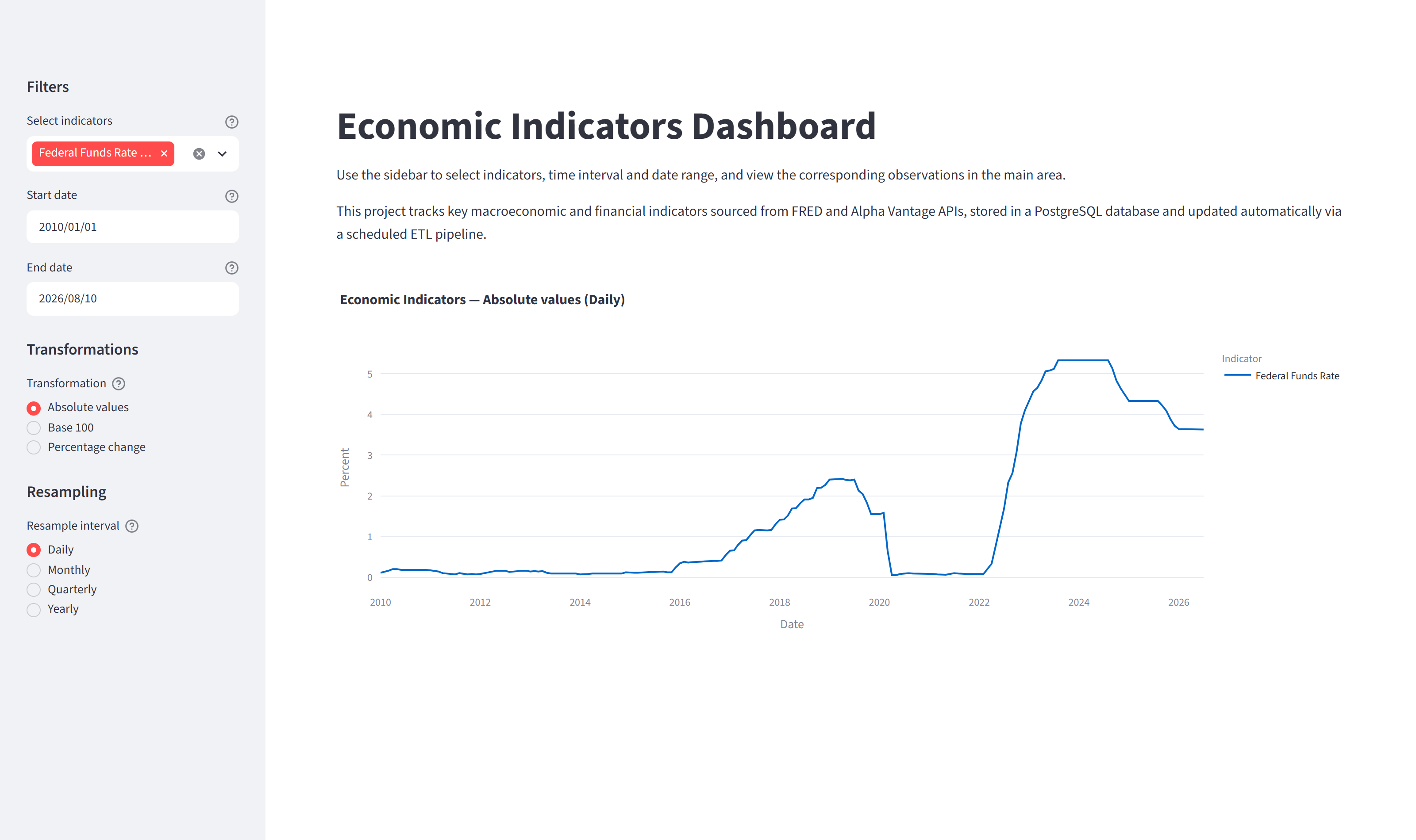
A Streamlit and Plotly dashboard reads from the database, never from the APIs, with Base-100 indexing, percentage change and day-to-year resampling. It is the visual endpoint of the pipeline: proof that the data landed correctly and is queryable.
Stack
- Language
- Python (pandas, psycopg2)
- Storage
- PostgreSQL 16
- Dashboard
- Streamlit + Plotly
- Infrastructure
- Docker Compose + Cron
- Sources
- FRED · Alpha Vantage APIs
What I learned
- Idempotency is the single most valuable property of a pipeline: upsert loads and safe re-runs simplified every failure scenario, because 'run it again' is always a valid answer.
- Isolating each indicator in its own transaction with its own error handling lets partial failures degrade gracefully. A malformed payload from one commodity costs you that commodity, not the night's run.
- A scheduled job is a different execution environment, not the same one on a timer. Cron starts with a minimal environment and inherits neither the container's credentials nor its PATH, so the pipeline snapshots what it needs at startup for the cron job to source. That was designed in from the start, because this is the kind of thing that fails silently at 3 a.m. rather than loudly at build time.
- Caching raw responses is an engineering and an economics decision at once: a 24-hour TTL is what makes a 25-calls/day API viable to develop against, since every re-run during development would otherwise burn the daily budget.
- Building the full chain end to end taught me more than the individual pieces did. Extraction, transformation and loading are simple in isolation; what is actually hard is what sits between them: scheduling, credentials, rate limits, and deciding what should happen when one link fails.
Limitations & next steps
- The dashboard is the visual culmination of the pipeline, not an analysis tool. The 13 indicators were picked to exercise two very different APIs, not because they form a coherent analytical set. A policy rate, an equity index and USD per bushel sit on scales that have nothing to do with each other. Base 100 and percentage change make them plottable on shared axes, but plottable is not the same as comparable, and I would not draw conclusions from it.
- No automated tests. Correctness has been verified by inspecting loaded data, not by a suite.
- Cron inside the container is the right size for this project but it is not an orchestrator: there are no retries, no dependency graph and no visibility into a failed run beyond the log file.
- There is no selective backfill: the pipeline refetches an indicator's full history rather than reconciling a date range, which is cheap at this scale and would not stay that way.
- The Alpha Vantage free tier is a hard ceiling at 25 calls a day; adding commodity sources means paying for it or rethinking the refresh cadence.
- What I want to build next is the dashboard this one is not: a coherent set of indicators chosen to answer real questions, with the comparisons and transformations that follow from those questions, putting the analysis first and letting the pipeline serve it rather than the other way round.
Outcome
- One `docker compose up` builds the database, applies the schema, loads all 13 indicators and starts both the scheduler and the dashboard.
- About 60,000 observations across 13 indicators, with history reaching back to 1947 for the oldest FRED series.
- Data refreshes automatically every night; a failed source is rolled back and logged, never fatal to the run.
- The dashboard confirms the data landed correctly and is queryable, with Base-100 and percentage-change transformations and a warning when mixed units would make a chart misleading.