Brand & Web Design · 2026
Wayra: Brand & Website
Brand, voice and website for Wayra, my family's artisanal tea from the Valle de Uco: a whole identity built around one idea, the wind, and the Astro site that brought it online.
- Branding
- Visual Identity
- Naming
- Web Design
- Astro
- Role
- Brand · Verbal Identity · Web Design & Build
- Timeline
- 2026 · Apr-Jun · ongoing
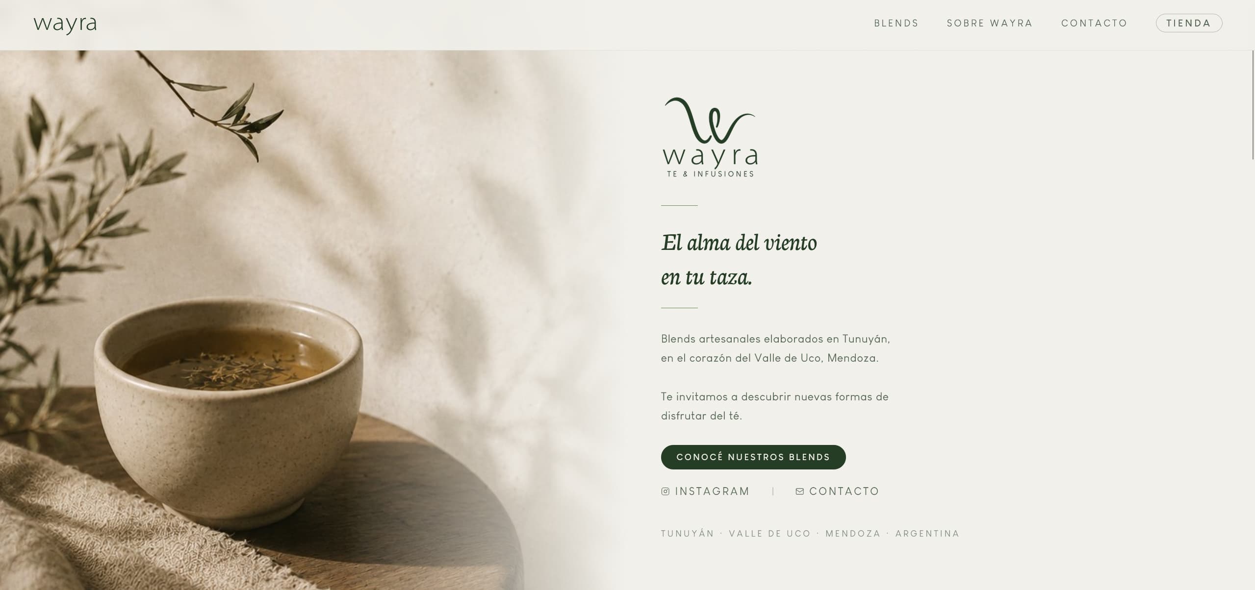
The venture
Wayra is a family venture from my own town, Tunuyán, in the Valle de Uco, Mendoza: artisanal tea and infusion blends made by my mom and my aunt. Wayra means wind in Quechua, and the whole brand grew out of that single word. My part was everything a customer meets before the tea itself: the name treatment, the visual identity, the voice, and the website.
The concept
I built the brand as a system around one idea, the wind. 'El alma del viento en tu taza' (the soul of the wind in your cup) is the line everything hangs from. That metaphor became the organizing structure: the seven blend families are each a kind of wind, from Andina, 'the wind born in the rock', to Vital, 'the wind that renews in silence'. Naming and identity were designed together, so the taxonomy of the product and the poetry of the brand are the same thing.
How I built it
- 01
Concept & naming
Turned a single word, Wayra (wind), into a naming system: the brand line, the seven blend families, and the voice that ties them together.
- 02
Visual identity
Designed the logo and the system around a natural, low-saturation palette (warm cream and deep forest green) and a rounded sans, so a printed label and a screen read as one brand.
- 03
Verbal system
Wrote the copy for each of the seven families, giving every one its own wind metaphor, character and moment, so the range reads as a family and not as seven unrelated products.
- 04
Website
Designed and built wayrate.com.ar in Astro: a fast static site that tells the story, presents the families and points to the online store.
Identity
- Concept
- Wayra (wind) · el alma del viento en tu taza
- Palette
- Warm cream + deep forest green
- Type
- LouisGeorge Café (rounded sans)
- Structure
- Seven blend families, each its own wind
- Web
- Astro (static)
- Store
- Tienda Nube (linked)
What I learned
- A brand is a system, not a logo: once the wind concept existed, every later decision (a family name, a label, a section of the site) had a rule to follow.
- Naming and design are stronger built together than in sequence; the seven families work because the words and the visuals were designed as one.
- Designing and building the same site in Astro taught me what is actually feasible on both sides, the same instinct my data dashboards rely on.
- Being part of the venture rather than an outside designer means the brand has to survive real use: new labels, cost calculations and products keep coming, so the system had to be simple enough for me to extend it every month.
Outcome
- Wayra launched with a complete identity: logo, palette, type and a seven-family system that runs across labels, Instagram and the web.
- The site is live at wayrate.com.ar, built in Astro, telling the story and pointing to the online store.
- The brand is in daily use and still growing; I keep designing labels and running the numbers as the range expands.